
Move
Client
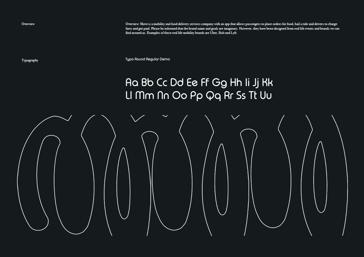
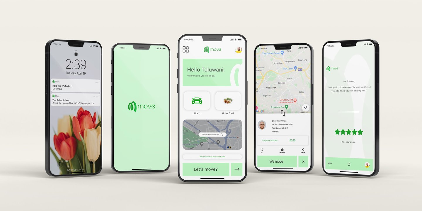
Created as a conceptual project during my time studying graphic design, Move explores what it means to design for mobility at scale. The brand imagines a seamless service connecting people, food, and transport, where movement isn’t just functional, but continuous, reliable, and human-centred.
The challenge was to create an identity that could hold all of these ideas together, something abstract, but still grounded in purpose.
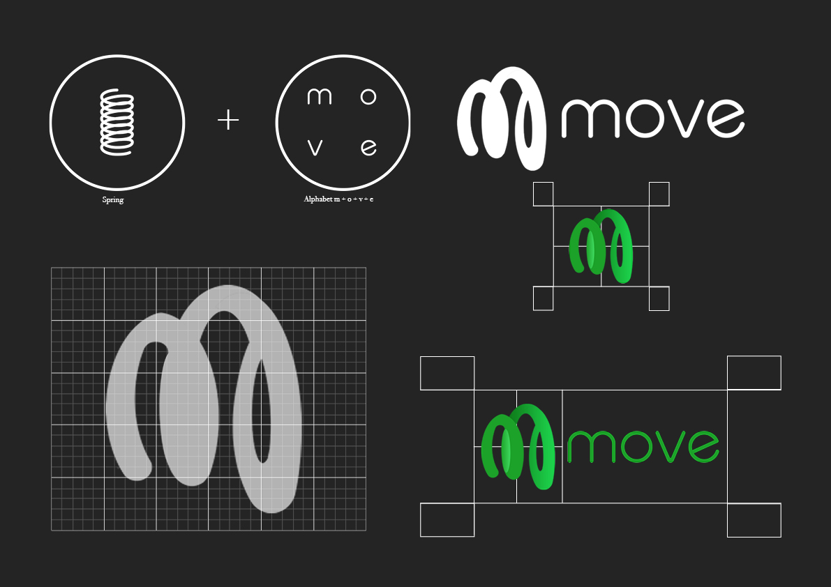
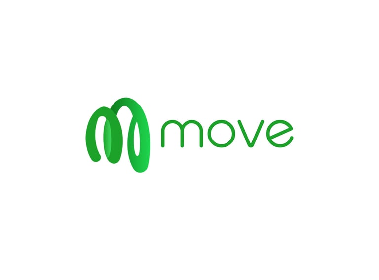
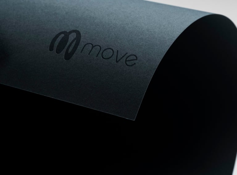
I designed movement from the inside out. Instead of focusing on obvious transport symbols, I looked deeper, drawing inspiration from the car spring, a hidden but essential component that supports weight, absorbs impact, and ensures a smooth journey.
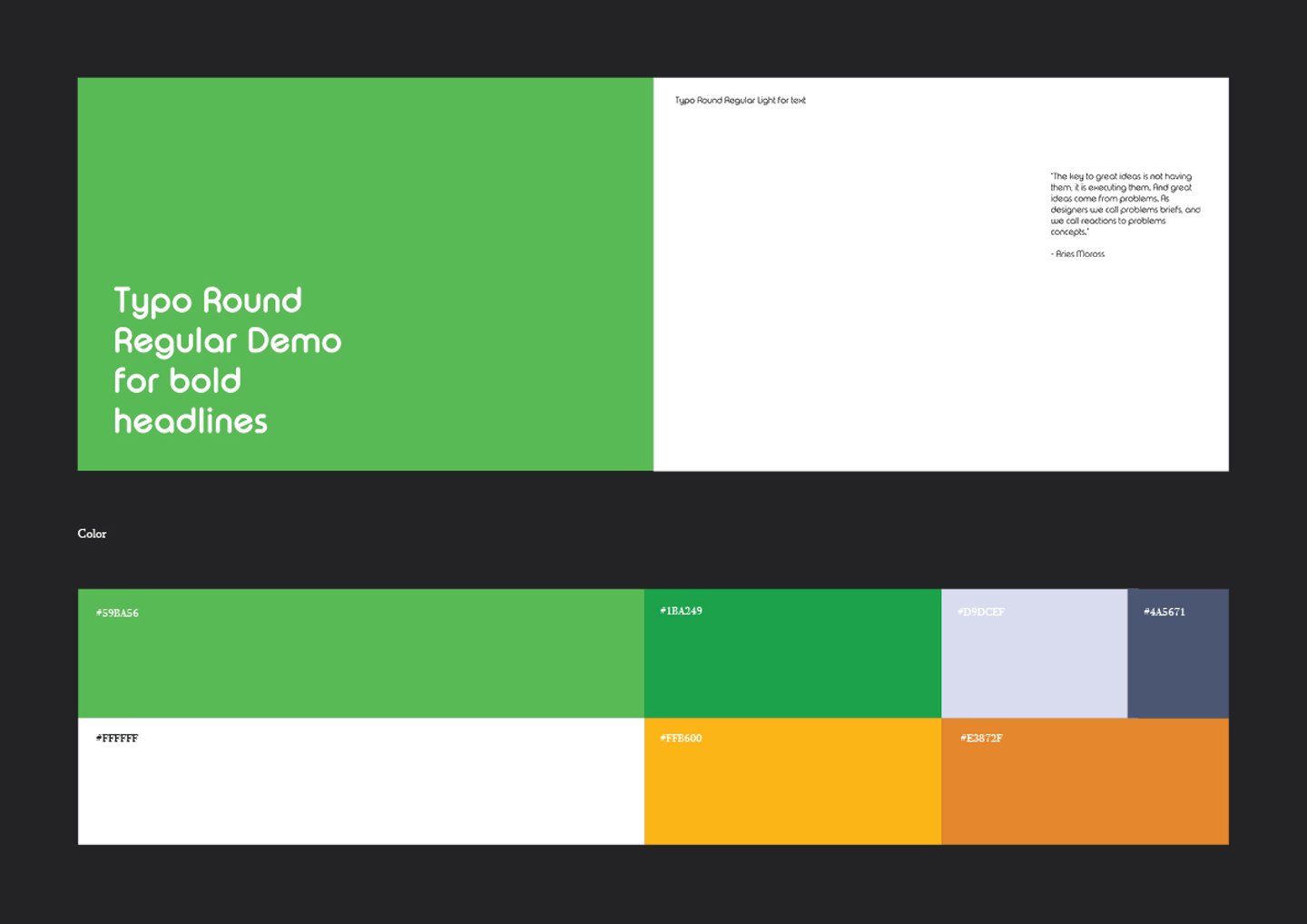
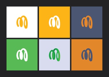
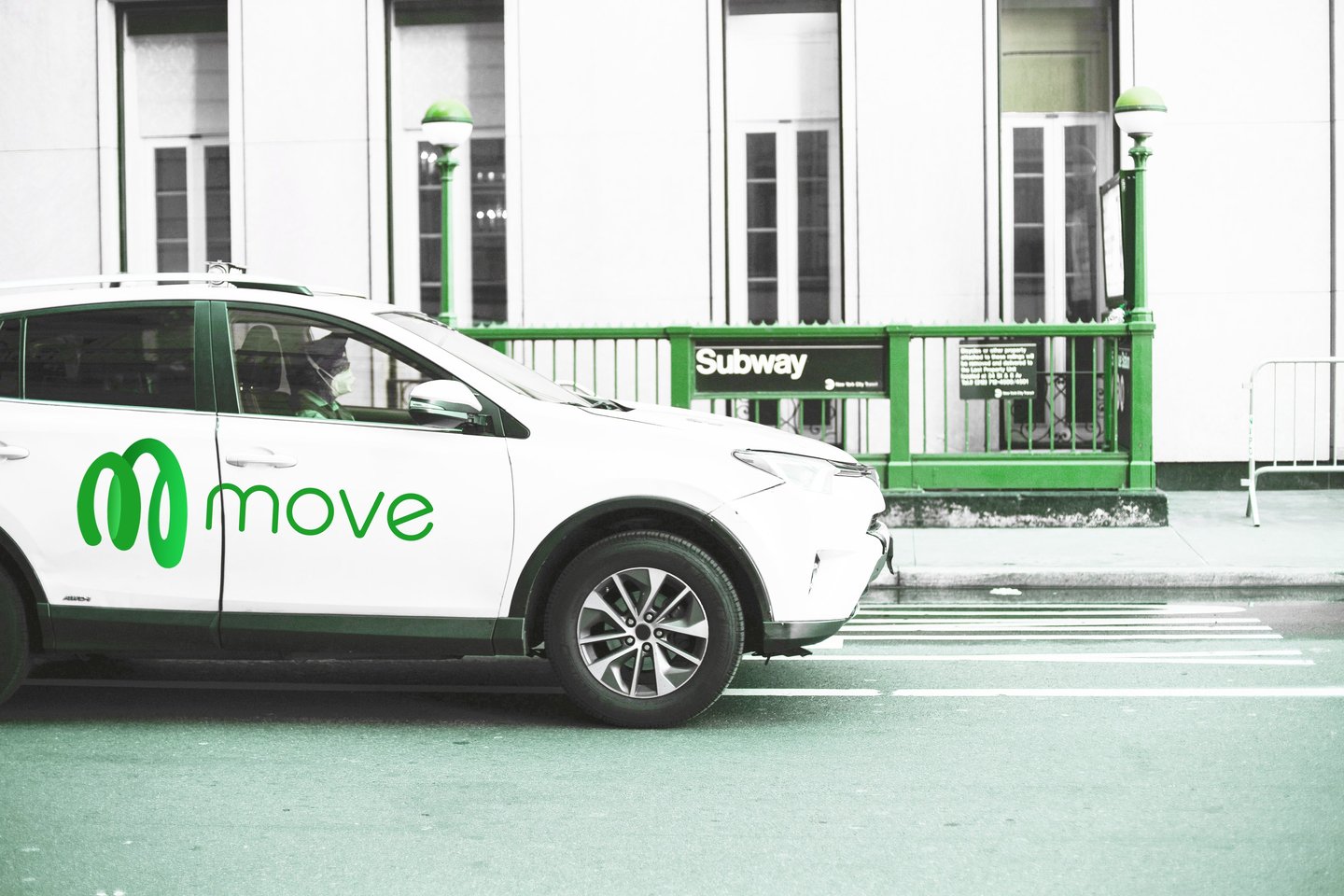
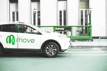
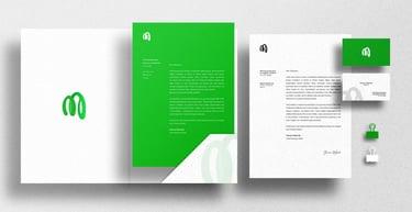
I translated this idea into a continuous form that subtly constructs the letters m + o + v + e, creating a logo that feels fluid, connected, and in motion. The result is a mark that reflects both the visible experience of movement and the invisible systems that make it possible, balancing concept with clarity.
Story
Year
What I did
Industry
Services
Logo Design
Concept Development
Brand Identity Design
Mobility, transport and technology
2022


London, United Kingdom.
© Toluwani Makinde 2026. All rights reserved.