
McManus Development
Client
McManus Development operates at the intersection of craft and reliability. Specialising in carpentry, roofing, and home repairs, the brand needed an identity that felt as solid as the work itself; dependable, precise, and quietly modern. The goal was not decoration, but clarity: a visual system that communicates structure, trust, and longevity at first glance.
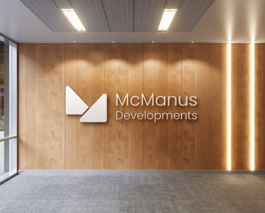
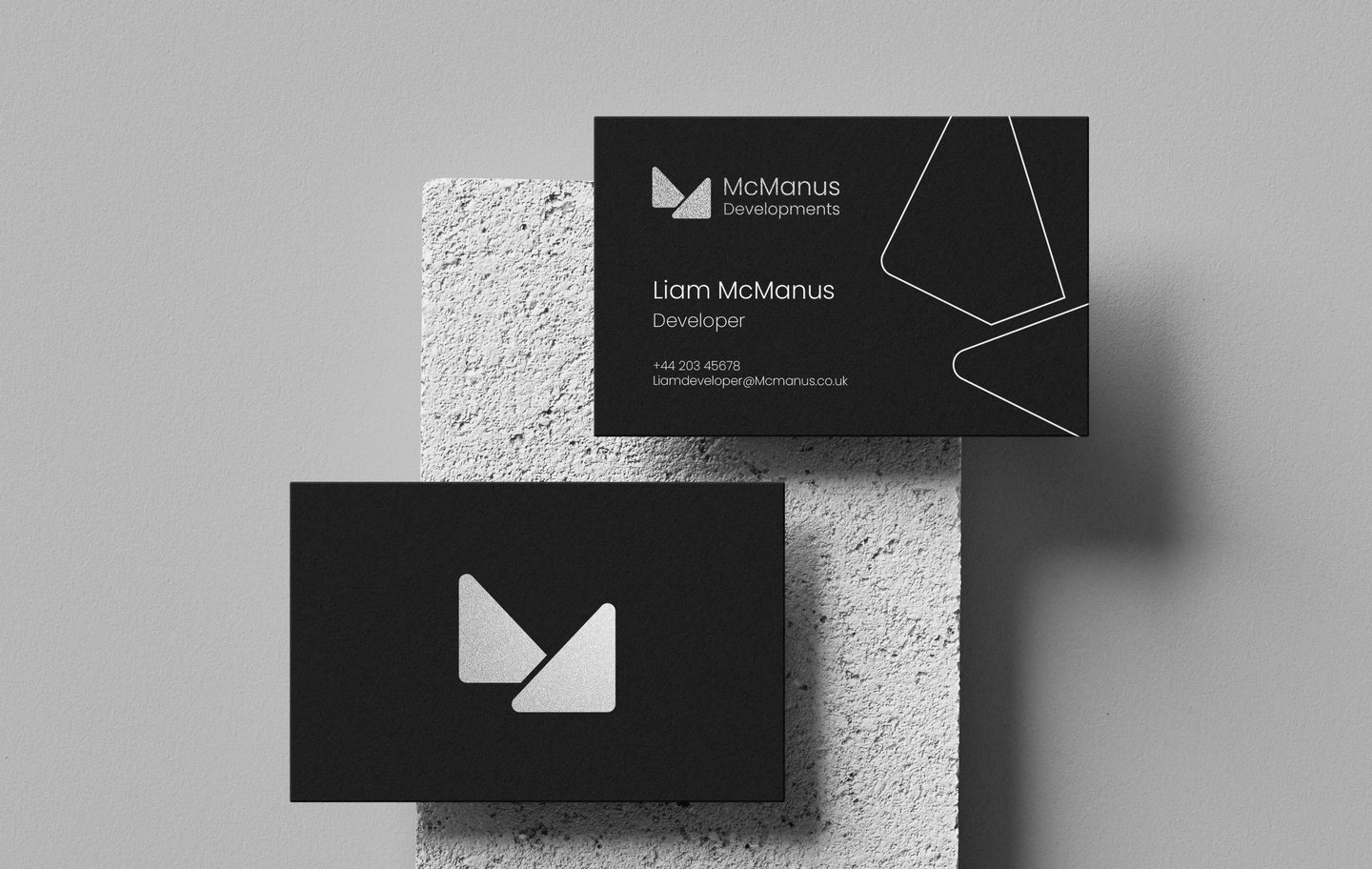
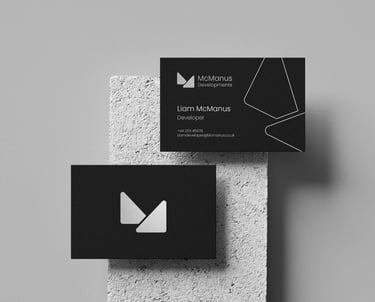
I gave structure a symbol
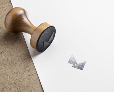
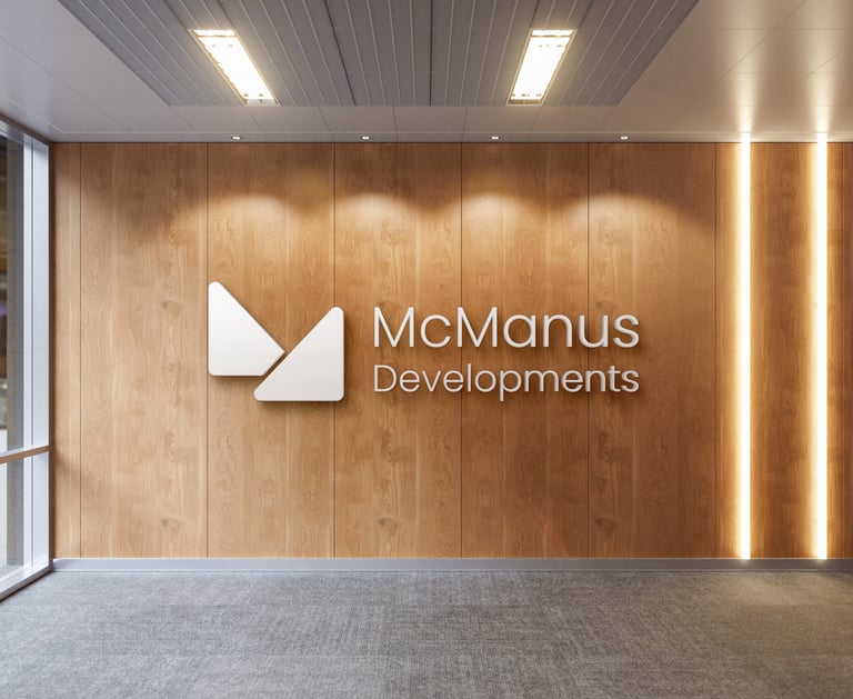
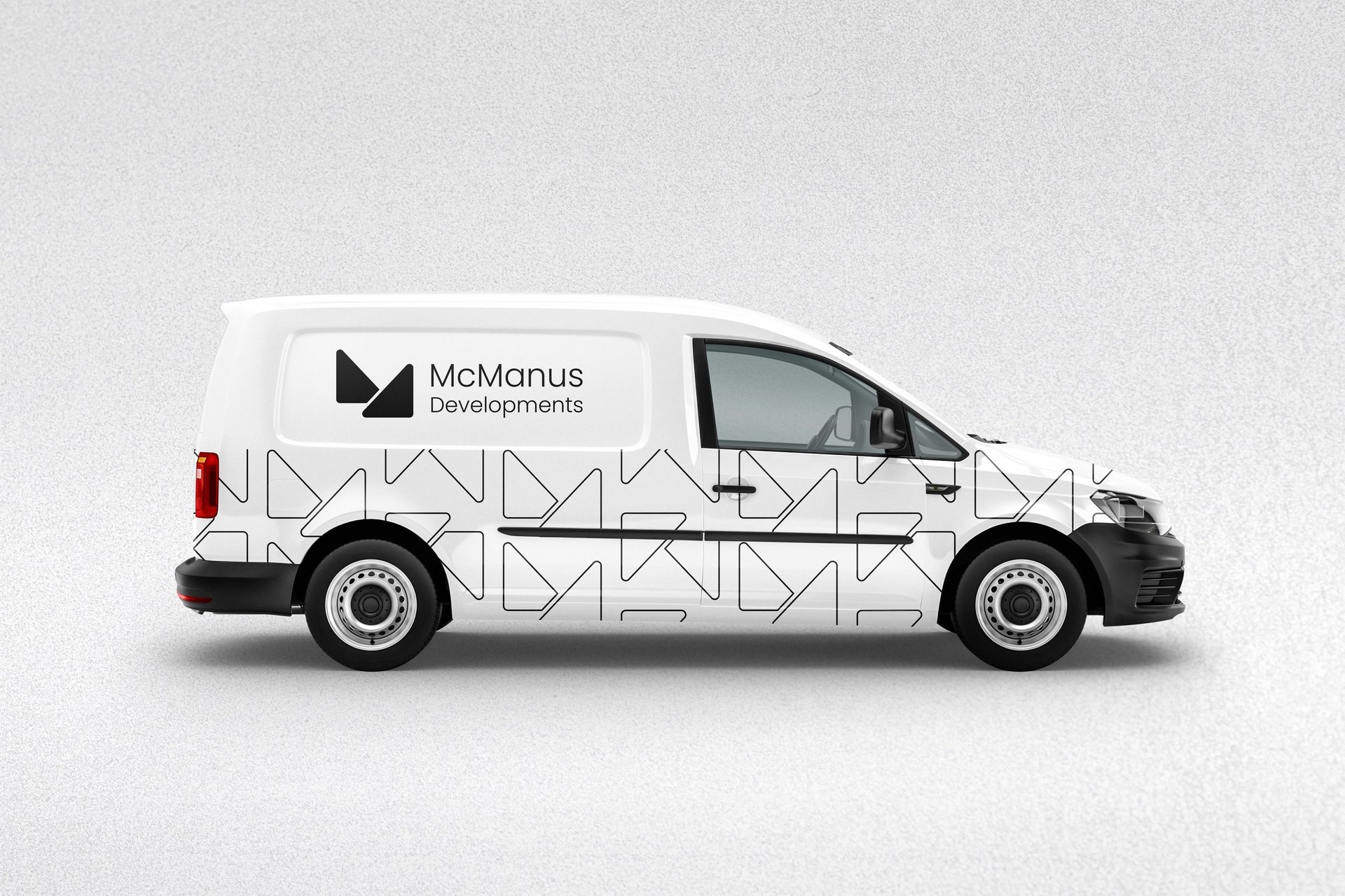
I designed a minimalist, geometric mark that translates construction into meaning. Two rounded triangular forms meet to create an abstract “M” and a subtle lowercase “d,” while simultaneously evoking the silhouette of a gable roof. The balance of angles and curves reflects both strength and approachability. A modern identity rooted in craftsmanship, designed to stand firm over time.
Story
Year
What I did
Industry
Services
Logo Design
Brand Identity Design
Visual System Development
Construction, Home Repairs & Maintenance
2025


A worthy competitor


London, United Kingdom.
© Toluwani Makinde 2026. All rights reserved.